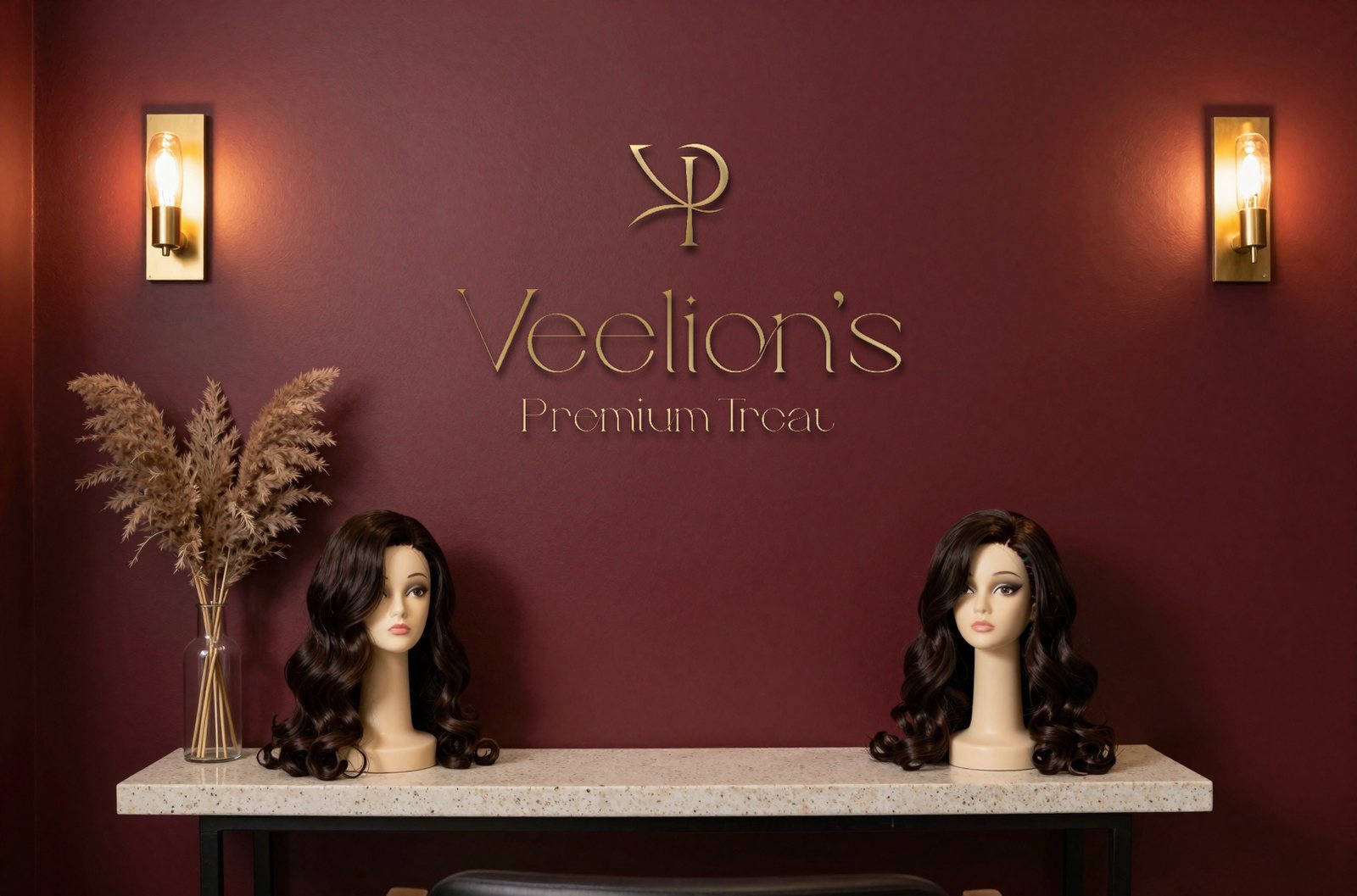
A full luxury rebrand for Veelion’s Premium Treat, a wig-care and beauty brand whose core is wig revamp, restoration, installation, and all-wig services. We repositioned the brand as a premium experience and rebuilt the identity from the mark up: the monogram, the wordmark, the palette, the service touchpoints, and a sixteen-frame brand film built to make every appointment feel like a ritual.
The mark
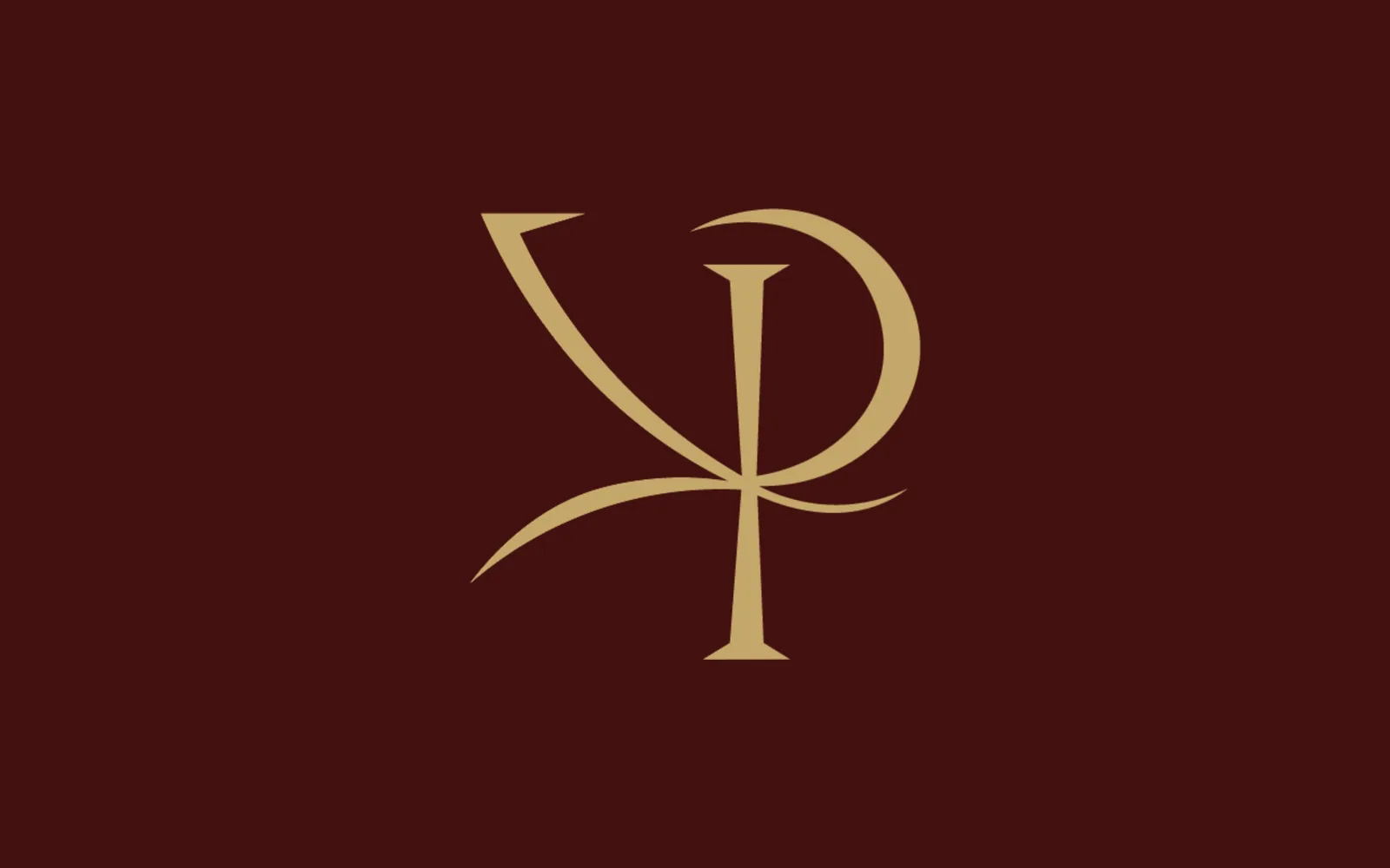
The identity centres on an interlocking VP monogram in gold: elegant, thin-stroked, and built with the restraint a luxury beauty brand needs. The V sweeps into the bowl of the P the way a strand of hair falls, so the initials read as one gesture rather than two letters placed side by side.
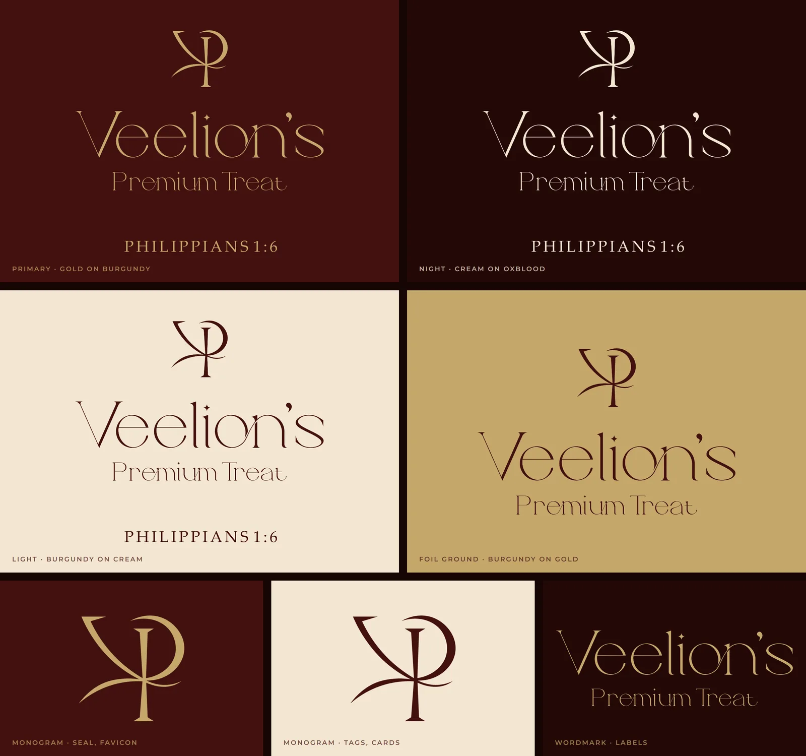
Logo system
The monogram sits above the Veelion’s wordmark and the descriptor Premium Treat. The brand carries a scripture reference, Philippians 1:6, as a quiet signature: a faith anchor that gives the name its meaning, used on the primary lockup and left off where space is tight. The monogram works alone on seals, tags and the favicon, and the wordmark alone on product labels.
Palette and mood
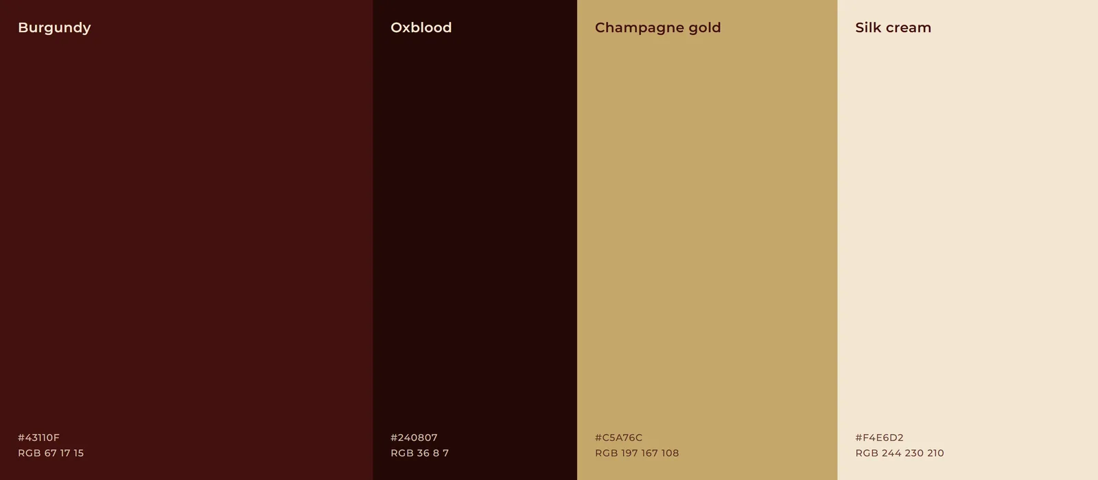
Deep burgundy and gold do the heavy lifting. The burgundy reads as richness and depth, the gold as the premium accent, and together they signal luxury before a single word is read. Satin, silk, glossy hair, low warm lighting, and champagne highlights set the mood across every touchpoint, while the skin-and-scalp range keeps the system welcoming beyond one gender or service.
- Burgundy
#43110F: the brand ground, on packaging, walls and screens - Oxblood
#240807: the night register, for evening materials and depth - Champagne gold
#C5A76C: the mark, the type and every foil - Silk cream
#F4E6D2: the light ground for cards, tags and print
Product and packaging
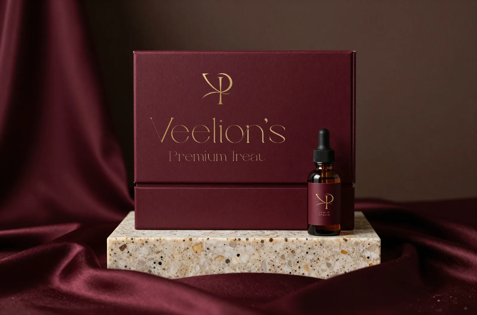
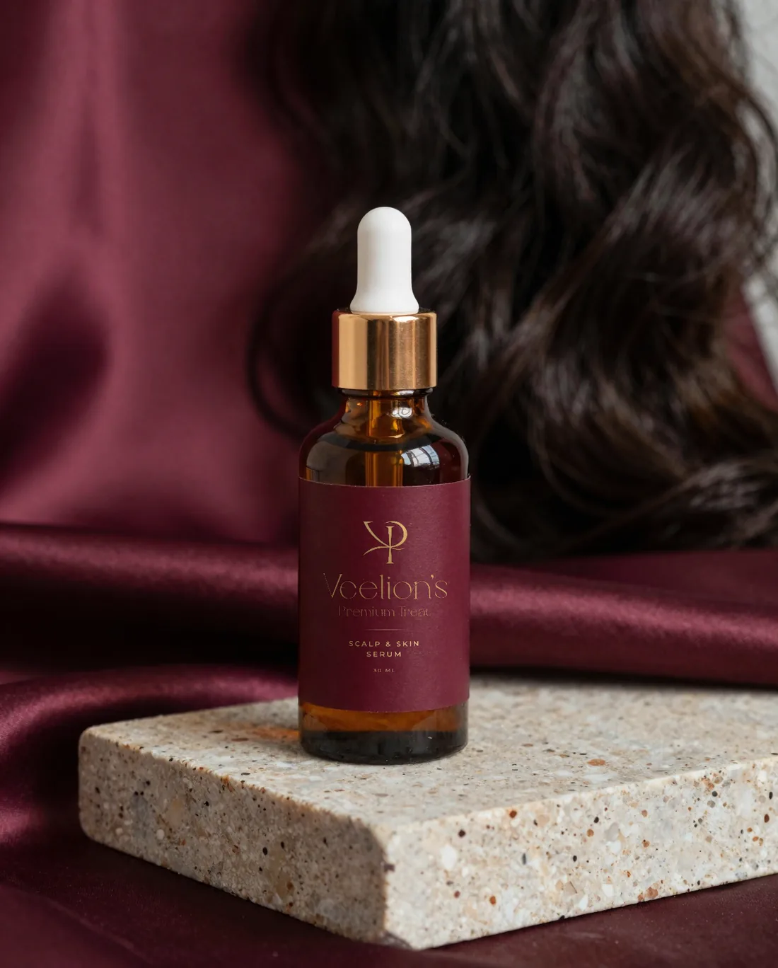
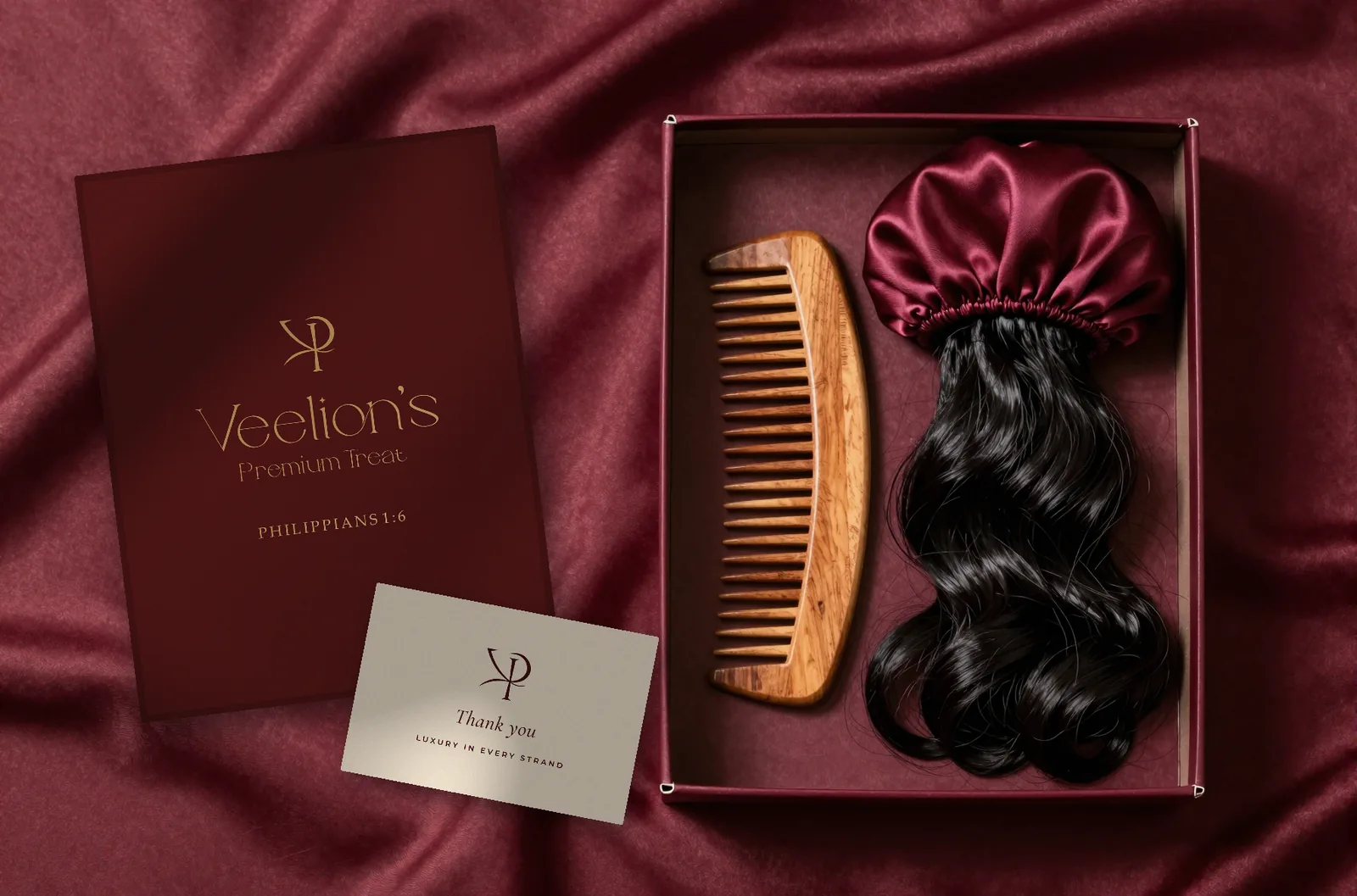
The system was carried into the full service handoff: a deep-burgundy wig box with the lockup in foil, a satin bonnet, a wooden comb, a thank-you card, and a skin-and-scalp serum. The monogram and wordmark hold their scale across the service kit and the care products, so the experience stays consistent from booking to unboxing.
In the studio
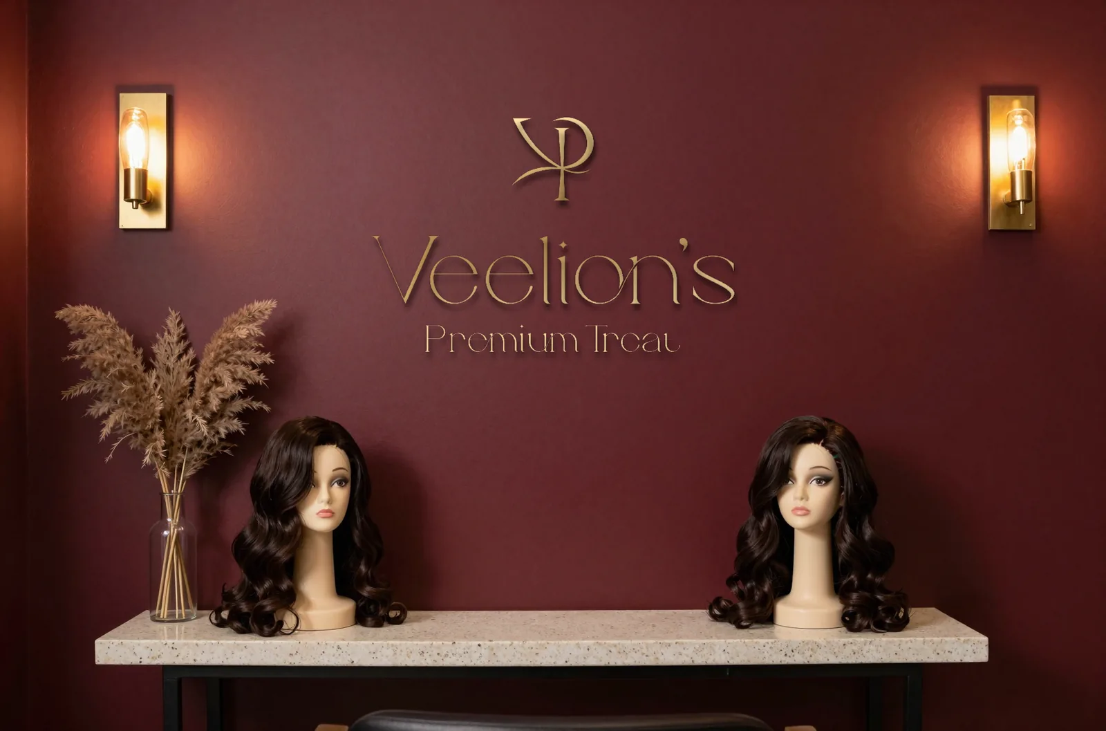
The same lockup goes up in brushed brass on the studio wall, between the lights, so the room a client sits in is the same brand as the box they carry home.
The brand film
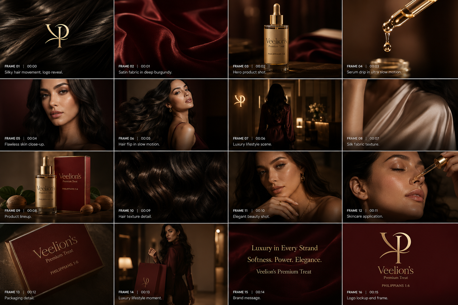
We storyboarded a sixteen-frame brand film that opens on a logo reveal over silky hair movement and moves through wig transformations, close-up texture, care rituals, a slow-motion serum detail, lifestyle scenes, and packaging, closing on the message: Luxury in Every Strand. Softness. Power. Elegance. Each frame is timed and art-directed so the edit feels inevitable rather than assembled.
Why it works
Luxury is built from consistency and restraint. One mark, one palette, one tone of voice, repeated everywhere the customer meets the brand. That is what turns a wig service into an experience people remember, and a care product into something they are proud to keep on the shelf.