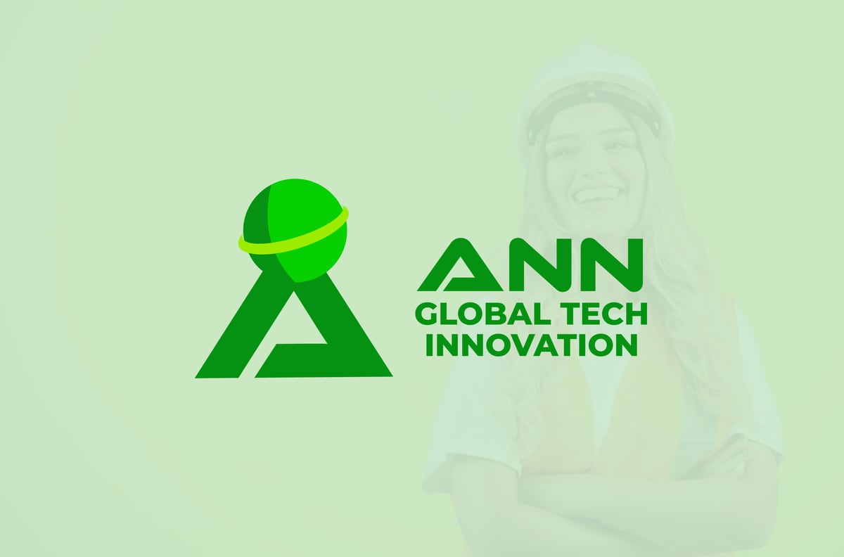
A brand identity for ANN Global Tech Innovation, a firm selling engineering and technology services. The brief is the one every company with Global in its name runs into: the word is a claim, and a logo that simply draws a globe next to the name does nothing to earn it.
The mark
The A is not a letter that has had a globe placed beside it. It is one continuous folded ribbon, turned back on itself so the fold reads as the letter’s counter, and the globe sits at the apex, carried by the structure rather than parked next to it. Reach is a consequence of what the company builds, not a sticker on top of it.
The globe is drawn in two tones split down its vertical axis, the darker half reading as terminator rather than shadow, with a single yellow-green ring cutting across it on an orbit. Two decisions do a lot of work there: the ring gives the sphere its axis without any latitude and longitude hatching, which is the detail that turns most globe marks to mush below about 30 pixels, and the two-tone split keeps the form spherical when the whole mark is knocked back to one colour.
The wordmark
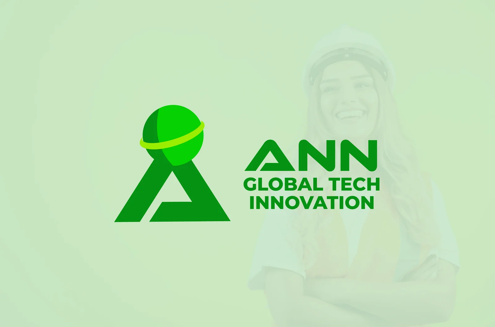
ANN is set large in a heavy geometric sans, with GLOBAL TECH INNOVATION stacked underneath at a fraction of the size and tracked out to align to the same optical width. The hierarchy is deliberate and slightly ruthless: the descriptor is three long words that no customer will ever say aloud, so the design lets them function as a subtitle and gives the memorable half of the name the whole first line.
The A of the wordmark repeats the flat-topped, chamfered geometry of the symbol, so the mark and the type read as one drawing rather than a logo with a font chosen for it.
Palette
Four tones, sampled from the artwork itself:
- #059212, deep green. The A, the wordmark, and the globe’s dark half. The workhorse, and the only colour needed for a one-colour application
- #06d001, bright green. The lit half of the globe, and the single point of high saturation in the system
- #9bec00, yellow-green. The orbital ring alone. Used nowhere else, which is what stops the mark reading as a generic eco logo
- #c7e4c0, pale green. The presentation ground, soft enough to sit behind photography without competing with it
Green for an engineering firm is a crowded choice, so the system earns its distinctiveness from value contrast rather than hue: three greens separated by brightness, not by three different colours pretending to be a palette.
Collateral
The identity was produced as a working set rather than a logo file: double-sided business cards, a letterhead, and a field flyer, all built off the same lockup and the same four tones.
The direction that did not ship
Before ANN Global, the same business was taken down a different route entirely, under the name Sure Technologies. That version was lime green on near black, and its mark was a house: a literal roof, chimney, and four-pane window, with the S of the wordmark drawn as a lightning bolt and the tagline Your satisfaction, our priority underneath.
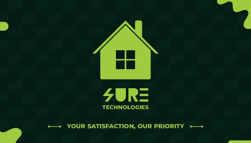
It was not bad work, and for the business as it was then it was accurate. The service list was electric fences, CCTV, gates, razor wire, pools: things installed at a house, sold to the person who lives in it. A house and a bolt say exactly that, and say it fast.
What killed it was ambition rather than execution. The house is a ceiling. It scopes the company to residential work in one city, and the moment the business started quoting for commercial and infrastructure jobs, its own logo was arguing against it. A literal mark is only as big as the thing it draws.
So the second direction dropped the picture of the service and drew the posture instead. A folded ribbon is not a building or a product, which is the point: it can carry a data centre as easily as a driveway gate. The globe made the reach explicit, and the name moved with it, from a promise about satisfaction to a claim about scope.
That is the whole lesson of the pair. The first mark described what the company did on the day it was drawn. The second describes what it is trying to become, which is the only one of the two a growing business does not outgrow.
Why it works
The test for a mark like this is not the presentation board. It is whether it survives being embroidered on a polo, screen-printed on a hard hat, and reduced to a 16-pixel favicon. Because the A is a single ribbon with no thin strokes, because the globe carries its axis on one ring instead of a mesh, and because the whole thing resolves in one green when it has to, it does.