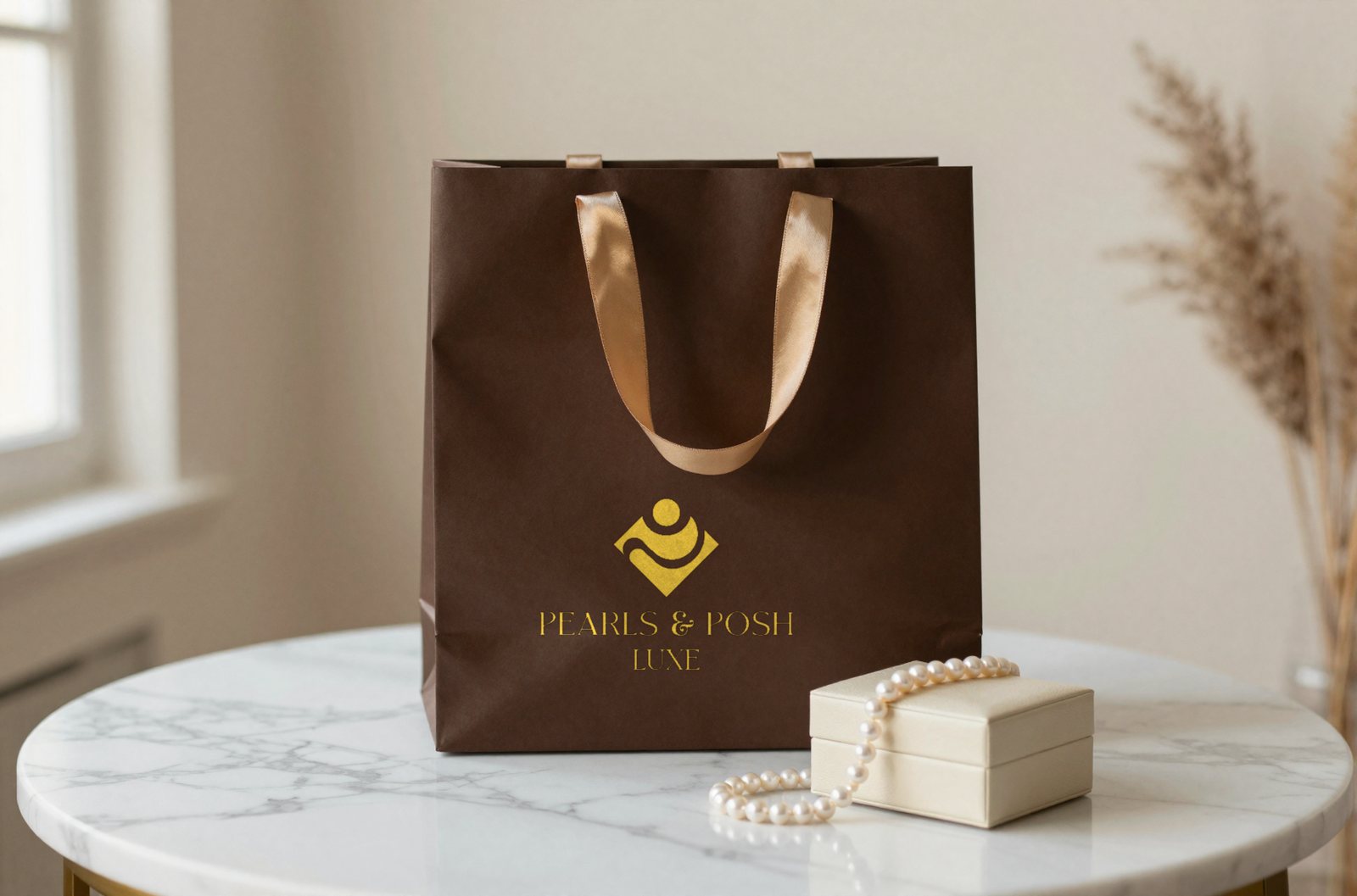
A full brand identity for Pearls & Posh Luxe, a luxury jewelry house built around the promise of timeless elegance. The brief: create an identity system that feels as refined as the pieces it represents: something a customer would recognise from the mark on a ring box before they ever read the name.
We delivered the mark, the wordmark, the palette, the type system, and a full collateral suite that carries the brand from a 9mm favicon to the fascia above a boutique door.
The mark
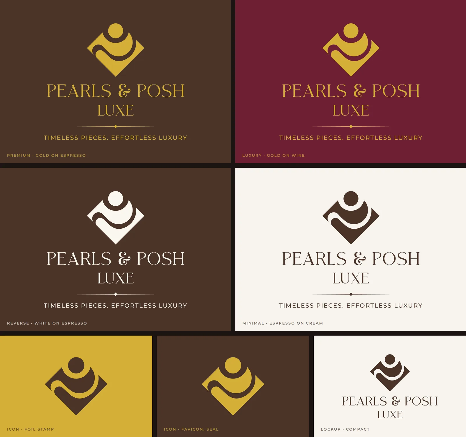
The identity centres on a diamond-framed symbol: an abstract pearl cradled by a flowing wave, set inside a rotated square. The pearl reads as both a jewel and a figure, a deliberate ambiguity that gives the mark warmth without losing the precision a luxury house needs. The diamond frame anchors the composition and gives the icon a footprint that works at every scale, from embossed foil on a card to a sign above a door.

Logo system
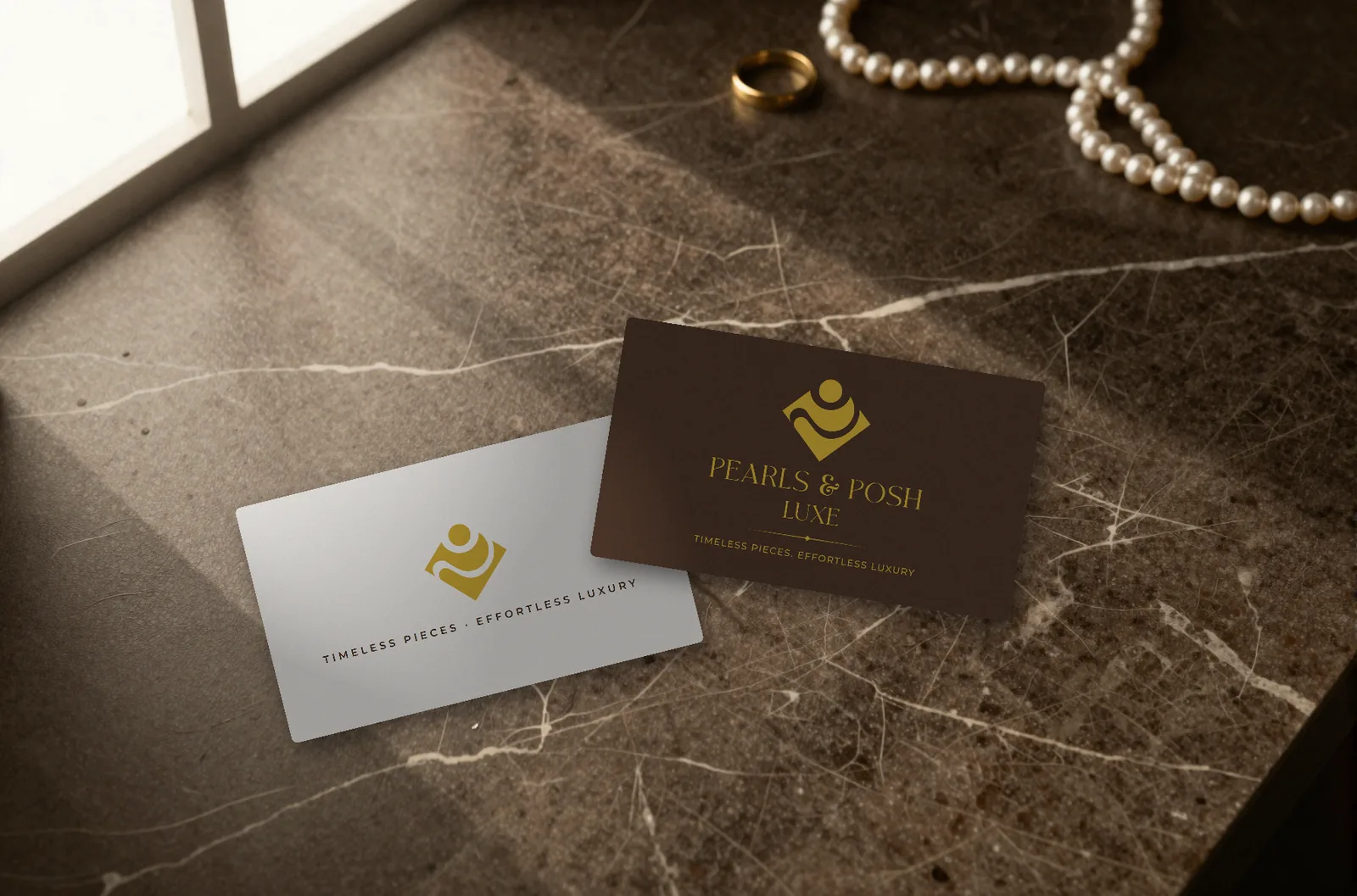
The mark pairs with the full brand name set in Moglan, a decorative serif with character, and the descriptor “LUXE” in Prata for quiet authority. Beneath, a fine ornamental rule with a centred diamond motif frames the tagline: Timeless Pieces. Effortless Luxury.
Four core colourways carry the brand across its full range, from deep-espresso luxury to understated editorial cream, with the icon and a compact lockup for the places the full signature will not fit.
Palette and type
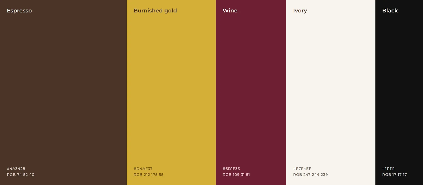
The palette does the positioning before a word is read:
- Espresso
#4A3428: deep, warm, grounding. The primary background for premium placements - Burnished gold
#D4AF37: the accent that signals luxury without shouting. Used for the mark, type, and foil - Wine
#6D1F33: a secondary dark for evening-register materials and colour variety - Ivory
#F7F4EF: the light ground for editorial, stationery, and web - Black and white: for the mono lockups and everyday utility
Two faces carry the identity: Moglan for the brand name and headlines, its curling ampersand a signature detail, and Prata for the descriptor and body headings. Montserrat Medium, wide-tracked, handles the tagline and all small supporting text.
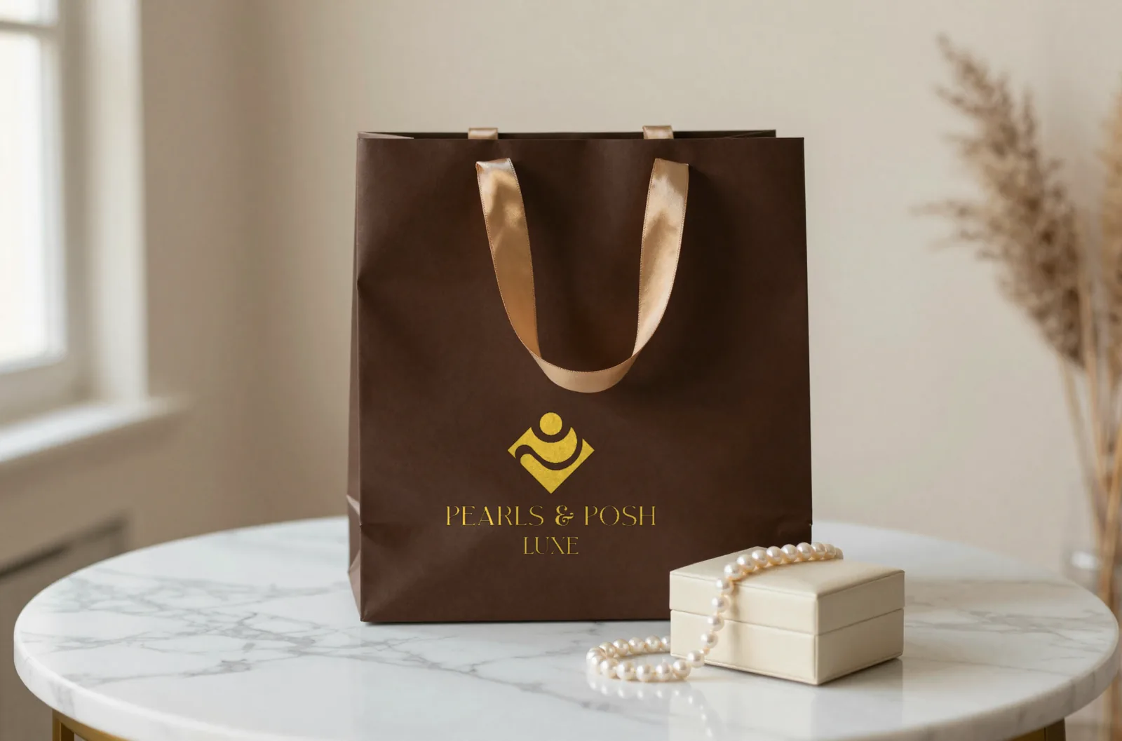
In the hand
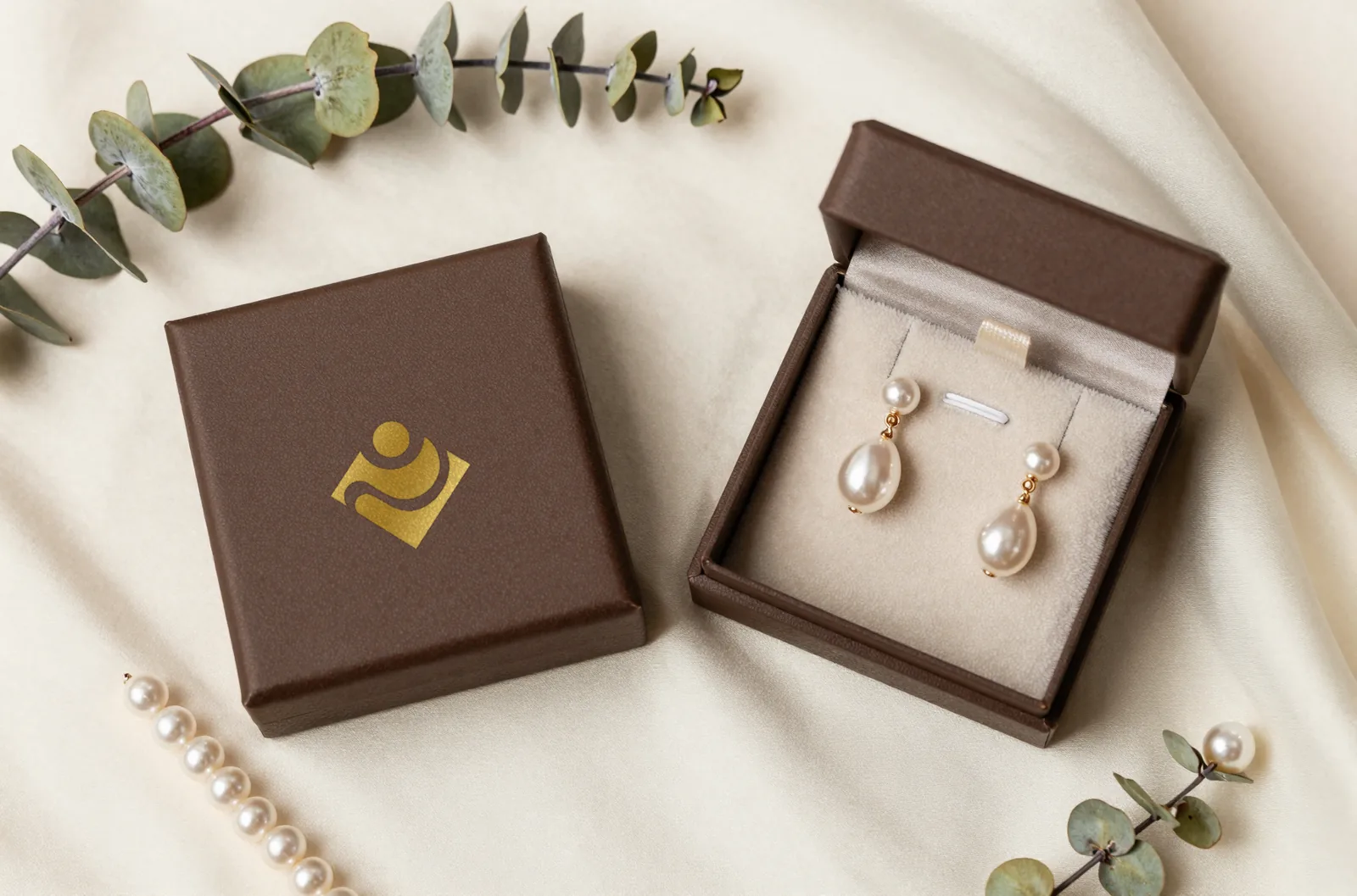
The identity carries onto every touchpoint a customer actually holds, each one built so the foil, the stock, and the mark reinforce the same promise the moment it is picked up.
On the street
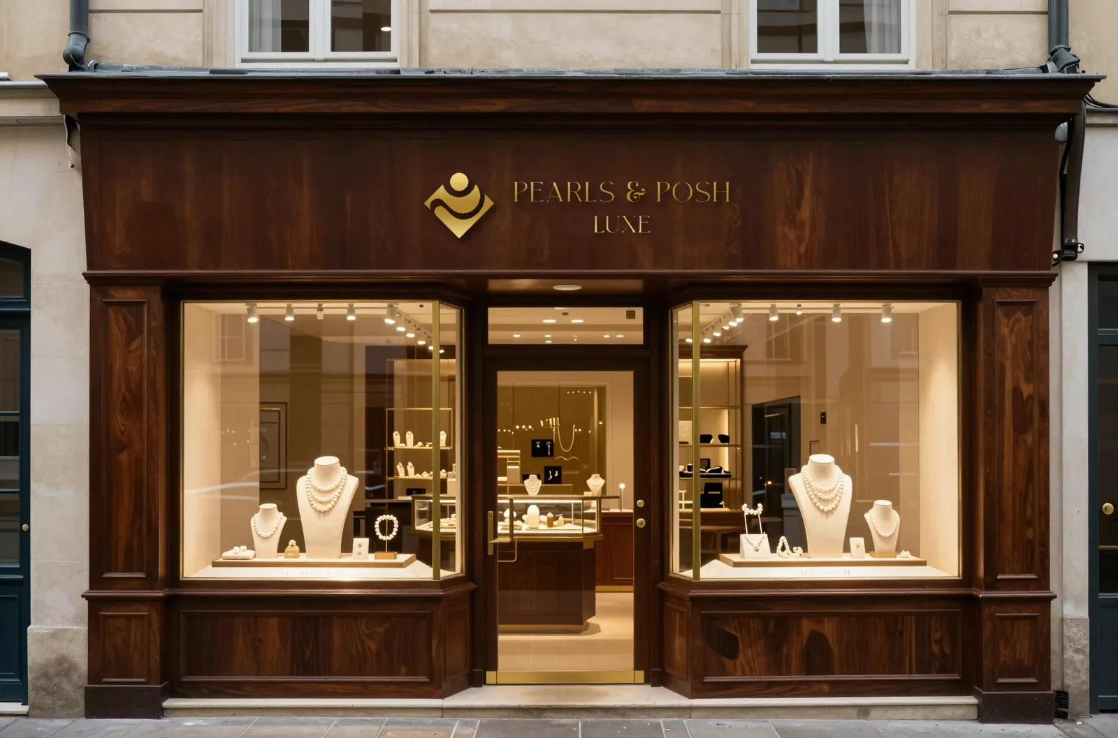
At full scale the mark becomes signage: the horizontal lockup set in brass on an espresso fascia, so the boutique reads as the same brand as the box in a customer’s hand.
Why it works
Luxury jewelry is one of the hardest brand registers to land. Too minimal and the brand disappears behind the product. Too ornate and it reads as costume. Pearls & Posh Luxe sits in the narrow band that works: a mark with enough character to be memorable, a palette warm enough to feel inviting, and a type system disciplined enough to stay elegant at every scale. Every touchpoint, from the foil on a ring box to the letters above the door, reinforces the same promise: timeless pieces, effortless luxury.