A full brand identity for SoundHome Technologies, an installer of security systems, audio/video systems, home automation, and network infrastructure. The category is crowded with the same two ideas: a padlock, or a house with a wifi arc coming out of it. Both say security company and nothing else.
We delivered the mark, the logotype, five lockups, the palette, and the print collateral that carries it, built so the identity still works stitched onto a polo shirt and printed at 12mm on an ID badge.
The mark
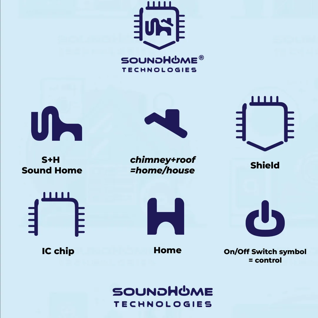
Every part of the mark is doing a job, and most of them are doing two.
The centre is an S and an H locked together, for Sound Home. Read the same shape again and the S becomes a chimney and a roofline: a house, drawn without drawing a house. That figure sits inside an outline that is simultaneously an IC chip, with its pin legs running down both sides, and a shield, tapering to a point at the bottom. Chip for the technology, shield for what the technology is for.
The logotype finishes the idea. In SOUNDHOME, the O is replaced by a power symbol: the universal glyph for on and off, which is what a control system actually gives you.
Logo system
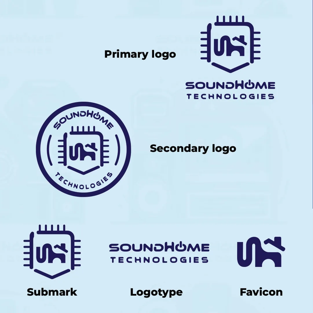
Five lockups cover every placement the business actually has:
- Primary: the mark above the stacked logotype. Documents, site headers, flyers
- Secondary: a circular badge with the name arced around the mark. Built for the places a rectangle fails, which for this client means embroidery, stickers, and the ID badges the installers wear on site
- Submark: the mark on its own, for tight and repeated placements
- Logotype: the name alone, for headers where the mark already appears elsewhere
- Favicon: the bare S+H monogram, with the chip frame stripped off. At 16 pixels the pin legs turn to mud, so the counter is what survives
One colour, both directions
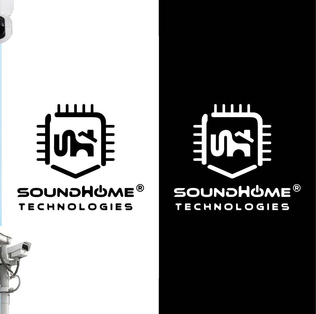
The mark is drawn as a single-weight outline with no fills and no gradients, so it holds as pure black on white and pure white on black. That is not a stylistic preference. This brand spends its life on vinyl on a van door, a one-colour stamp on an invoice, an embroidered chest logo, and an engraved plate, none of which can render a gradient.
Palette
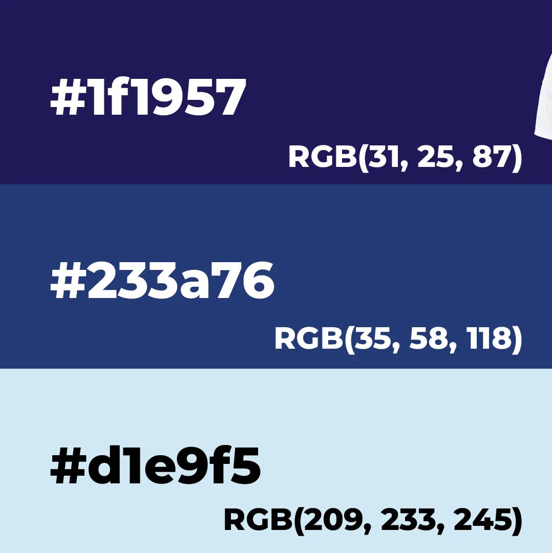
Three tones, deliberately narrow. Security work sells on looking calm and competent, and a wide palette reads as consumer electronics rather than trade:
- #1f1957, deep indigo. The mark colour and the primary dark ground
- #233a76, mid blue. Panels, secondary fills, and the darker half of split layouts
- #d1e9f5, pale blue. The light ground the whole system sits on
Notably there is no alarm red anywhere in the identity. Red is left free, so that when it does appear on a product panel or a warning state, it still means something.
Applications
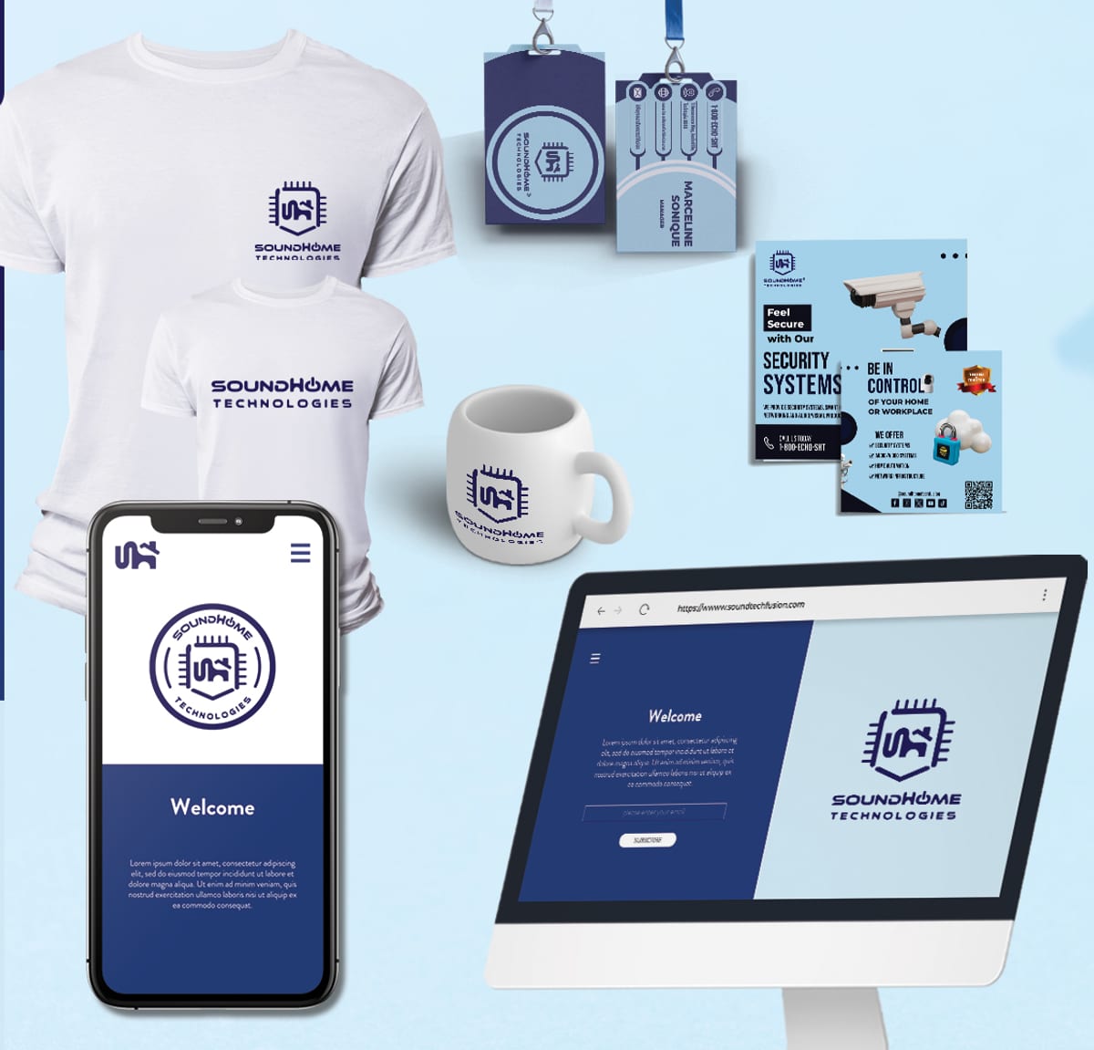
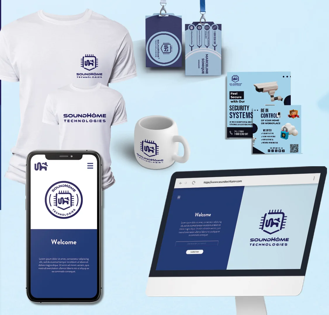
The system was drawn against its real placements rather than presented in the abstract: work shirts carrying the mark on the chest and the logotype across the back, two-sided ID badges on lanyards for installers arriving at a customer’s home, a mug for the office, the flyer pair, and the site in both mobile and desktop states.
The ID badge matters more here than it looks. This is a business whose staff ask to be let into people’s houses, so a badge that reads as legitimate at arm’s length is a sales asset, not stationery.
The flyer
One sheet, two jobs. The front leads with the worry the customer already has and names the product that answers it: Feel Secure with Our Security Systems. The back turns it around to the benefit, Be in Control of your home or workplace, and only then lists the four service lines: security systems, audio/video systems, home automation, and network infrastructure.
Contact detail is doubled deliberately. A QR code for anyone holding a phone, and a plain handle for everyone else, because a flyer that only works with a scanner is a flyer that half the recipients throw away.


Why it works
Most security branding reaches for the padlock, and a padlock is a picture of the problem rather than the product. The SoundHome mark is a picture of the answer: a house, held inside a chip, shaped like a shield, under a switch you control. It is one drawing a customer can read without being taught, and one outline that survives every place this business actually puts its name, from a browser tab to the back of a work shirt.