This is a concept piece. NAMO is a self-initiated brand we designed to show what a full identity looks like when it is built as one system. The work is complete and ready to produce; it has not been commissioned by a paying client. If you run a shop, a cafe or any business people walk into, we design your version of it. See what the branding work includes.
NAMO is a small coffee and bakery for people who work, meet and make things nearby. You come in for a slow first coffee and something warm from the oven, and you stay a little longer than you planned.
The brief was to give that feeling a face. The identity grows out of one symbol, and every other part of the system, the shapes, the palette and the way it writes, is taken from that one drawing.
The idea
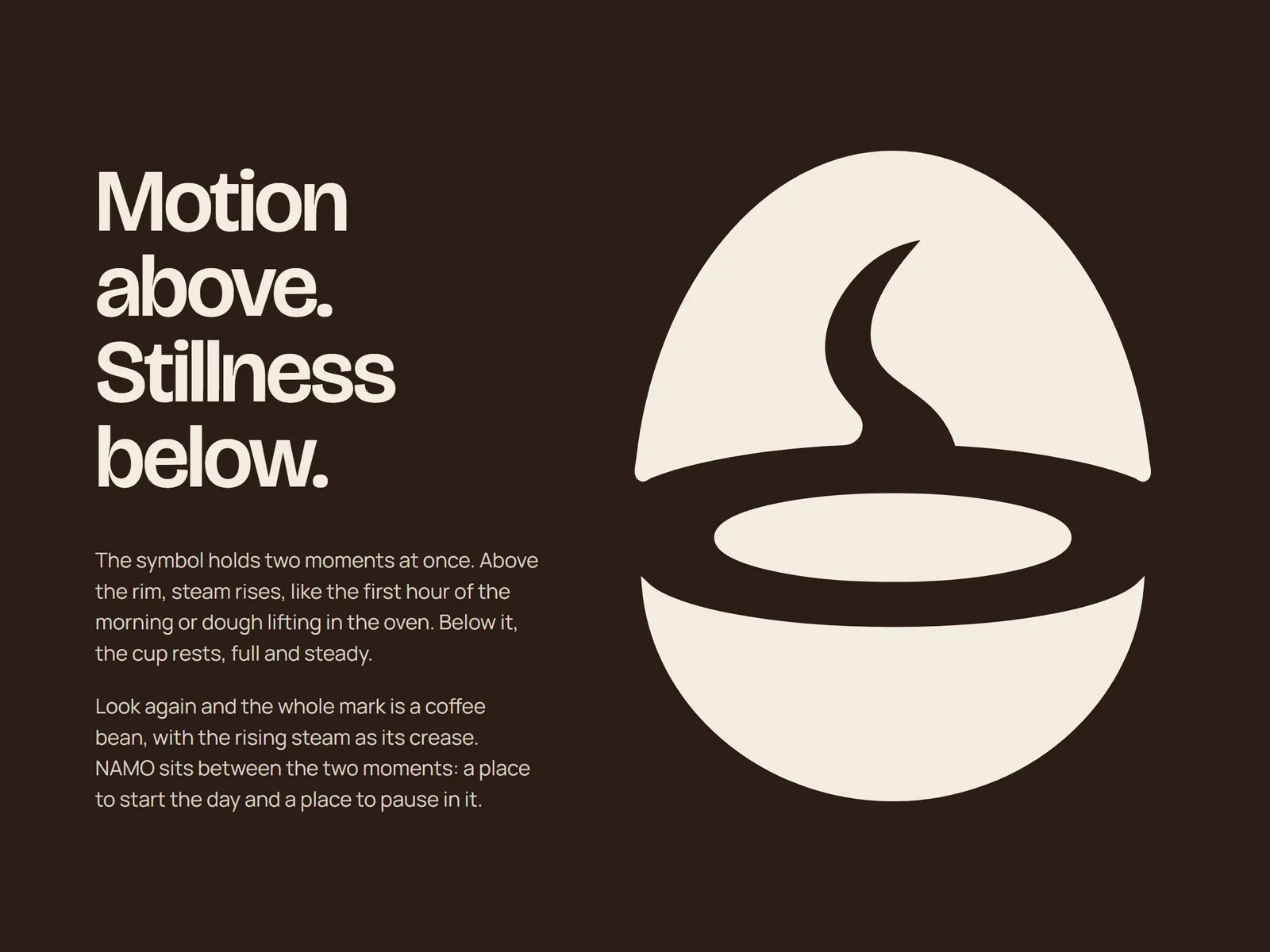
The symbol holds two moments at once. Above the rim, steam rises, like the first hour of the morning or dough lifting in the oven. Below it, the cup rests, full and steady.
Look again and the whole mark is a coffee bean, with the rising steam as its crease. NAMO sits between the two moments: a place to start the day and a place to pause in it.
Logo system
The wordmark carries the same weight as the symbol. The letters are short and soft at the corners, with edges that wander slightly, so it feels drawn by a person. At four letters it stays compact, which helps on a rubber stamp as much as on a shop sign.
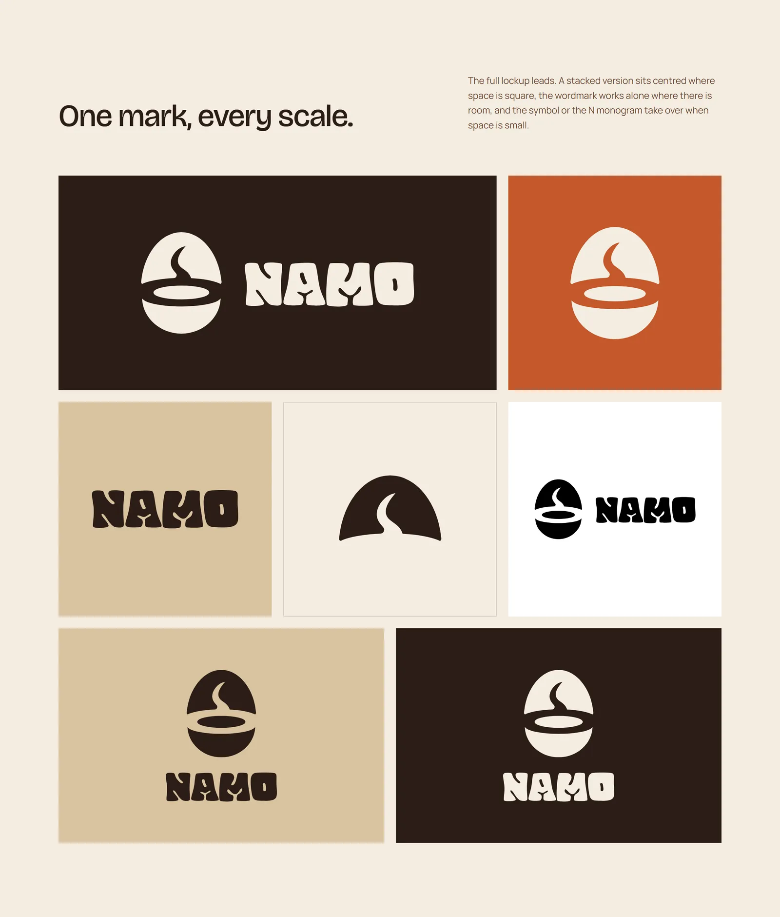
The full lockup leads. A stacked version sits centred where space is square, the wordmark works alone where there is room, and the symbol or the N monogram takes over when space is small.
The logo in use
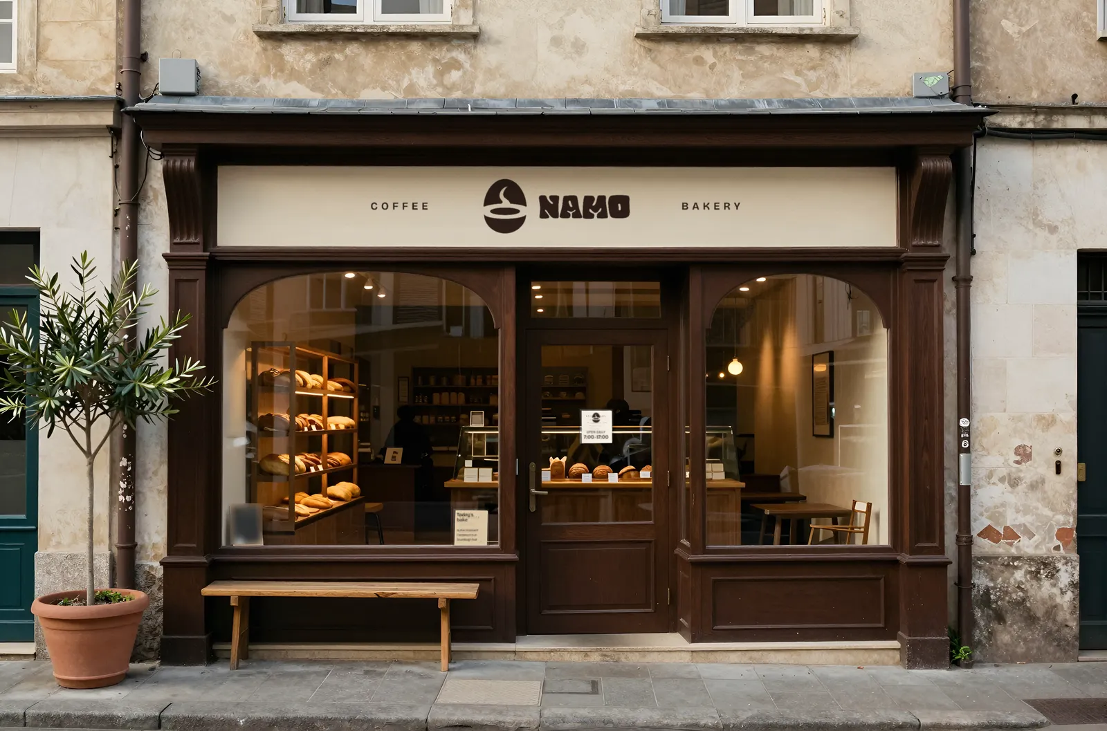
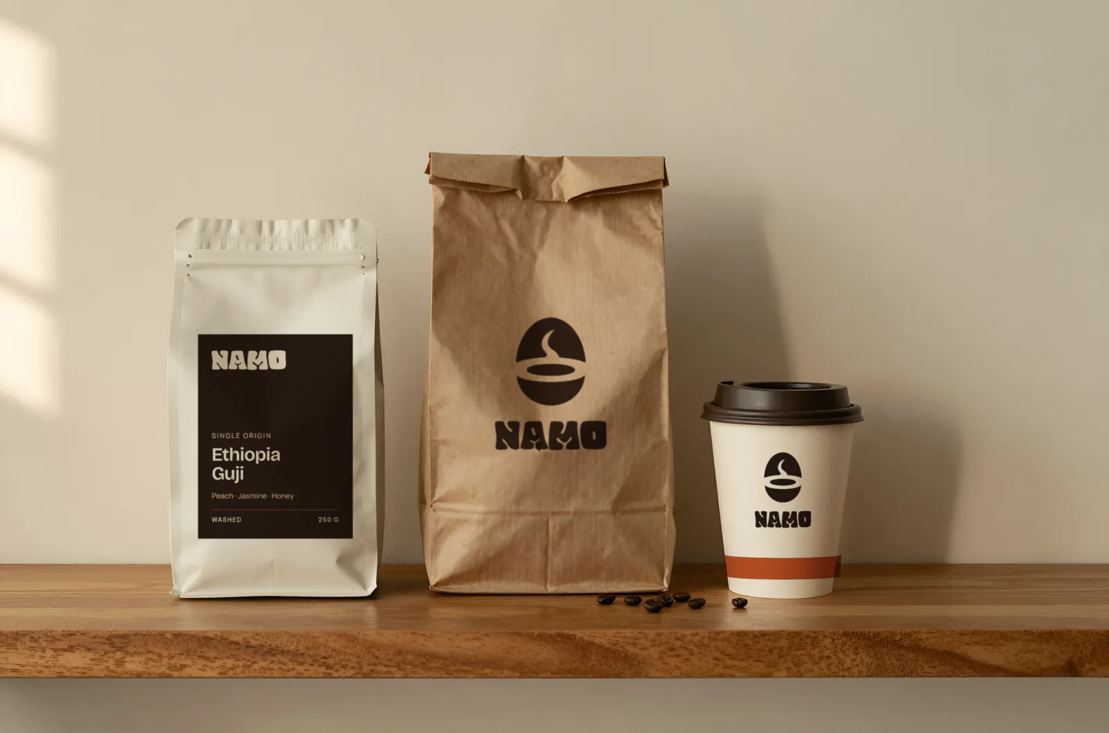
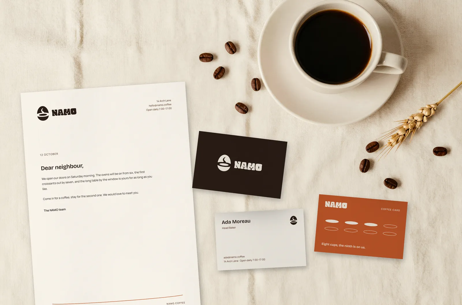
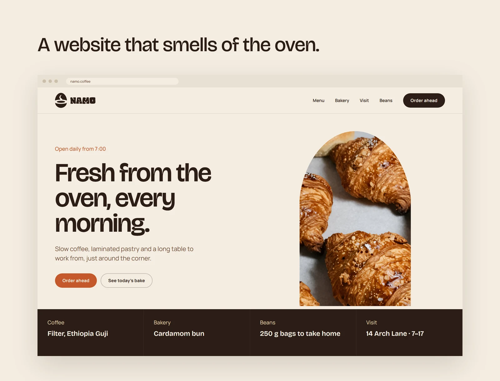
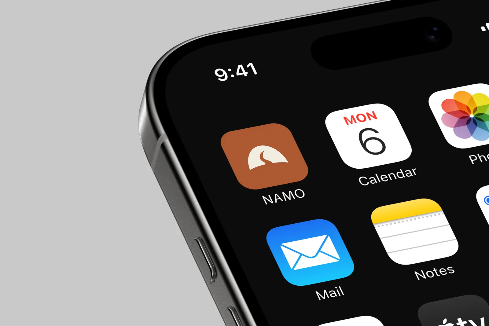
The mark has to work in the places a customer actually meets it: above the door, on the bag they carry out, on the card in their wallet and on their phone. The same drawing does all of it, at every size.
See the full project
This page shows the logo where it matters most. The full case study, with the construction of the symbol, the colour and type system, the order-ahead app and the shop interior, is on Behance.